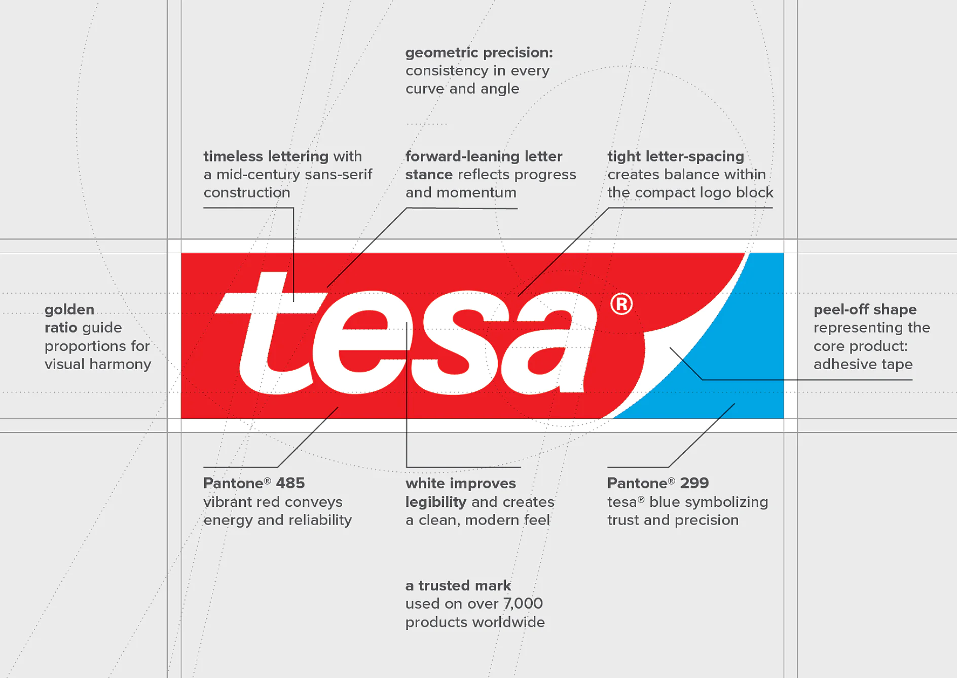
As we celebrate the 35th anniversary of our iconic logo, we honor not only its visual appeal, but also the values it represents. This powerful symbol represents our entire tesa team of over 5,400 employees worldwide who bring our brand to life every day.
35 years of the iconic tesa logo design
History
In a world where brands constantly evolve to keep pace with trends, the tesa logo stands as a rare exception – a timeless design that has remained unchanged since its debut in 1990. This year, we celebrate 35 years of a visual identity that has become a global symbol of trust, innovation, and adhesive excellence.
A Timeless Design in a Changing World
The tesa logo is more than a graphic - it’s a design icon. With its distinctive tricolor palette of tesa blue, vibrant red, and crisp white, and the characteristic “peel-off corner,” it has become instantly recognizable across continents and industries.
“The strength of our logo lies in its brilliant simplicity. The peel-off corner isn’t just decorative -it’s functional, reflecting the very essence of our adhesive products.” explains Thorsten Sperlich, Head of Global Communication, and adds: “The logo’s clean geometry and strategic color contrast ensure visibility and legibility across all formats -from digital interfaces to physical packaging."

The Color Philosophy
The tesa logo's signature colors were chosen with specific brand qualities in mind:
- Vibrant Red (Pantone 485): This energetic hue conveys dynamism and reliability, immediately drawing attention while suggesting the strength and durability of tesa products.
- tesa Blue (Pantone 299): The distinctive blue symbolizes trust, precision, and professionalism – qualities that have defined tesa's approach to adhesive solutions for decades.
- Crisp White: The white space isn't merely background - it creates breathing room that enhances legibility while representing clarity and purity in product performance.
Structural Brilliance
Beyond color, the logo's architecture follows principles of design excellence:
- The Iconic “Peel-Off Corner”: Perhaps the most ingenious element, this shape isn't merely decorative - it directly represents tesa's core product: adhesive tape. It creates an instant visual connection to the product experience.
- Tight Letter Spacing: The carefully calibrated proximity between characters creates a balanced, cohesive unit that functions effectively as a single visual entity.
- Forward-Leaning Stance: The subtle forward tilt of the letterforms reflects progress and momentum - symbolizing tesa's innovative spirit and forward-thinking approach.
- Geometric Precision: Every curve, angle, and line follows strict geometric principles, ensuring consistency across all applications and at any scale.
The Mathematics of Beauty
The tesa logo exemplifies how mathematical principles can create enduring visual harmony:
- Golden Ratio Proportions: The relationship between logo height, width, and element spacing follows proportions aligned with the golden ratio (approximately 1:1.618), a mathematical relationship found throughout nature and classical design.
- Timeless Typography: The mid-century sans-serif construction strikes the perfect balance between modernism and classicism, allowing it to transcend design trends.
The Power of Simplicity
Perhaps the tesa logo's greatest achievement is its apparent simplicity. At first glance, it seems straightforward – yet this simplicity is the result of rigorous refinement that eliminated everything unnecessary while preserving everything essential.
This minimalist approach enables instant recognition across diverse contexts. Whether glimpsed on a small product package or displayed prominently on corporate signage, the logo maintains its integrity and impact.
In addition, the design transcends language and cultural barriers, functioning effectively in every market where tesa operates without requiring localization or modification.
A Design That Bonds Generations
Over the past 35 years, the tesa logo has remained a constant in a rapidly shifting business landscape. While other brands have rebranded multiple times, the logo has endured-building brand recognition and trust. It has become a visual anchor for our customers, partners, and employees alike.
This consistency is not just aesthetic – it’s strategic. It reinforces our commitment to quality and reliability, and it reflects the values that have guided us for more than 125 years. The tesa logo is more than a graphic element - it’s a seal of quality that stands for continuous innovation and reliability. And it will continue to represent tesa’s commitment to innovation, sustainability, and adhesive excellence. It is not a mirror of the past - it is a foundation for the future.


